
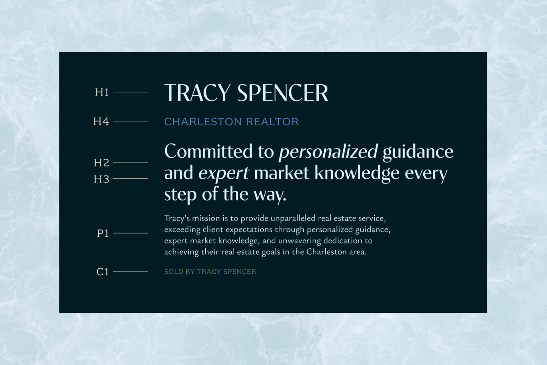


My goal was for Tracy Spencer’s brand to feel like a walk through Charleston: charming, sophisticated, and instantly memorable. She wanted to bottle up the lowcountry elegance and translate it into a visual identity that her dream real estate clients could resonate with. The heart of this project was a 'ts.' icon originally created by a friend of Tracy’s daughter. She loved the personal history behind it, so we refined and incorporated it as the centerpiece of her final brand. From there, we built out a color palette, typography, and a landing page that felt welcoming to her clients. It was all about honoring where she started while creating a digital home that feels high-end, personal, and full of character.