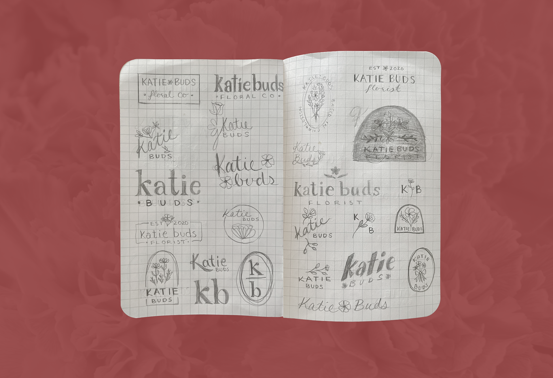
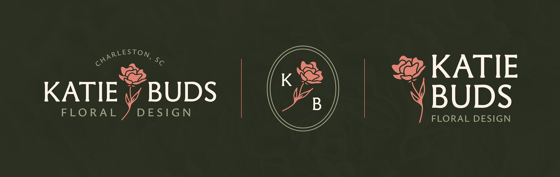
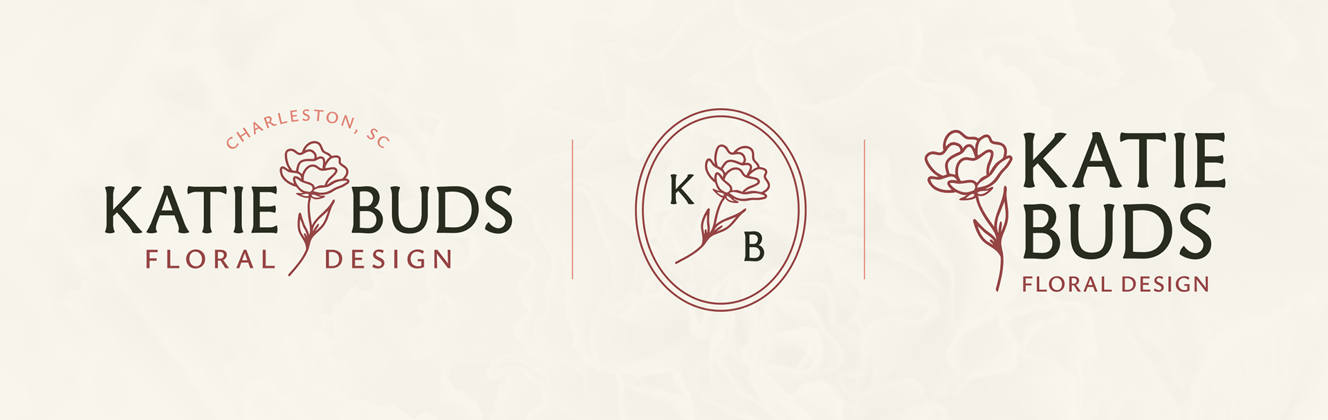
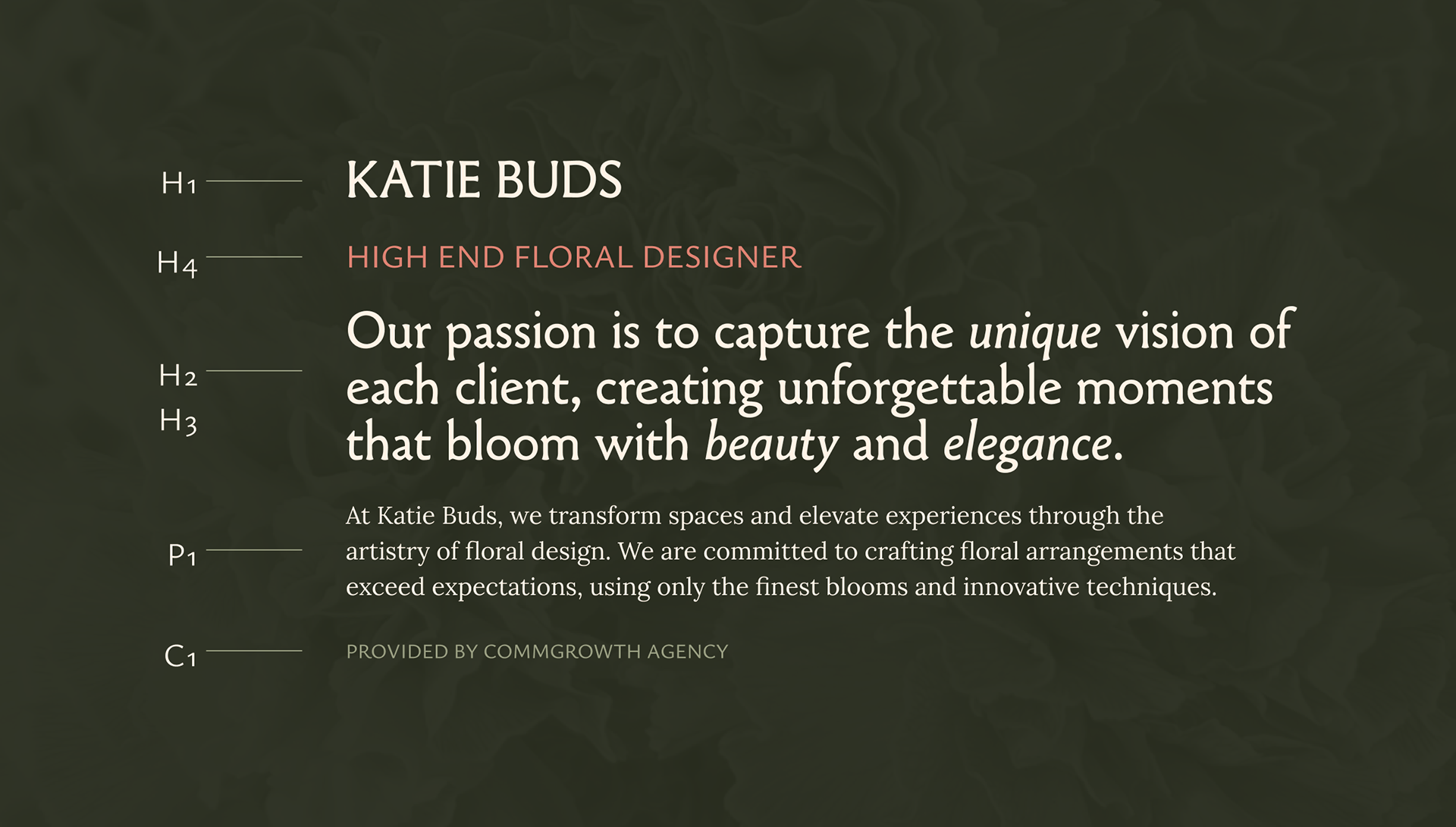
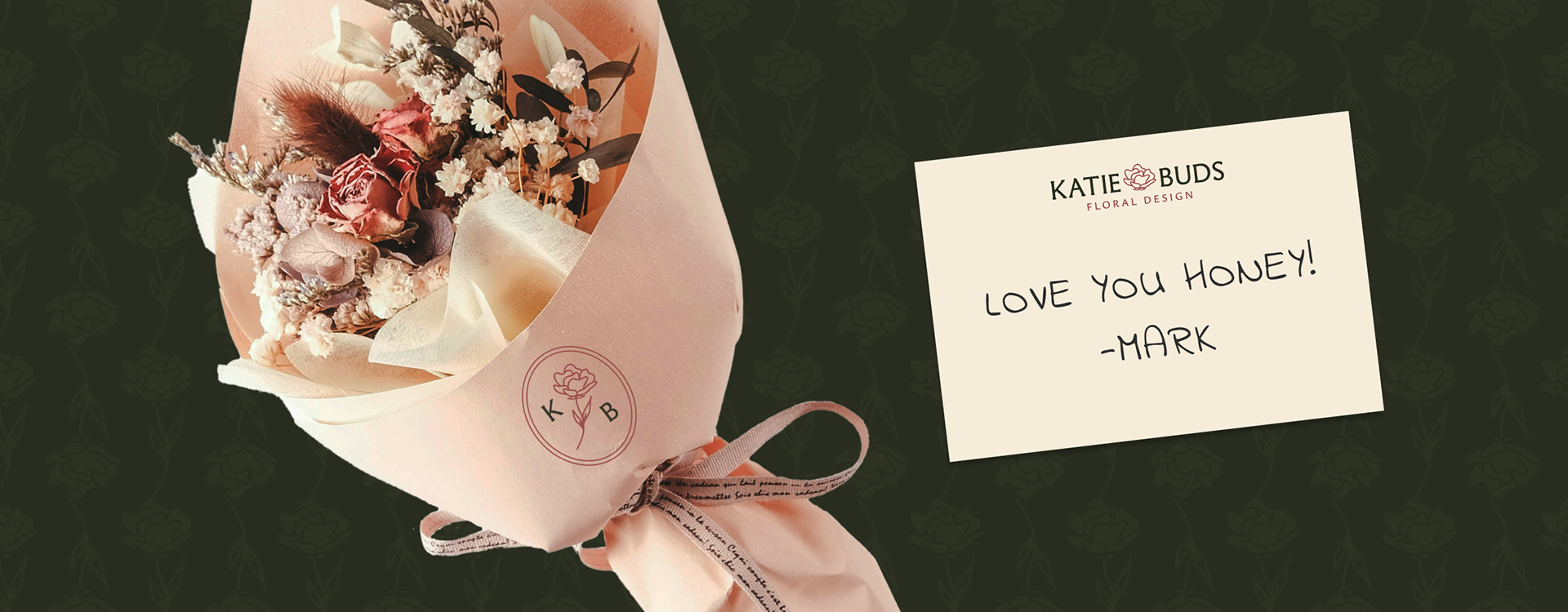
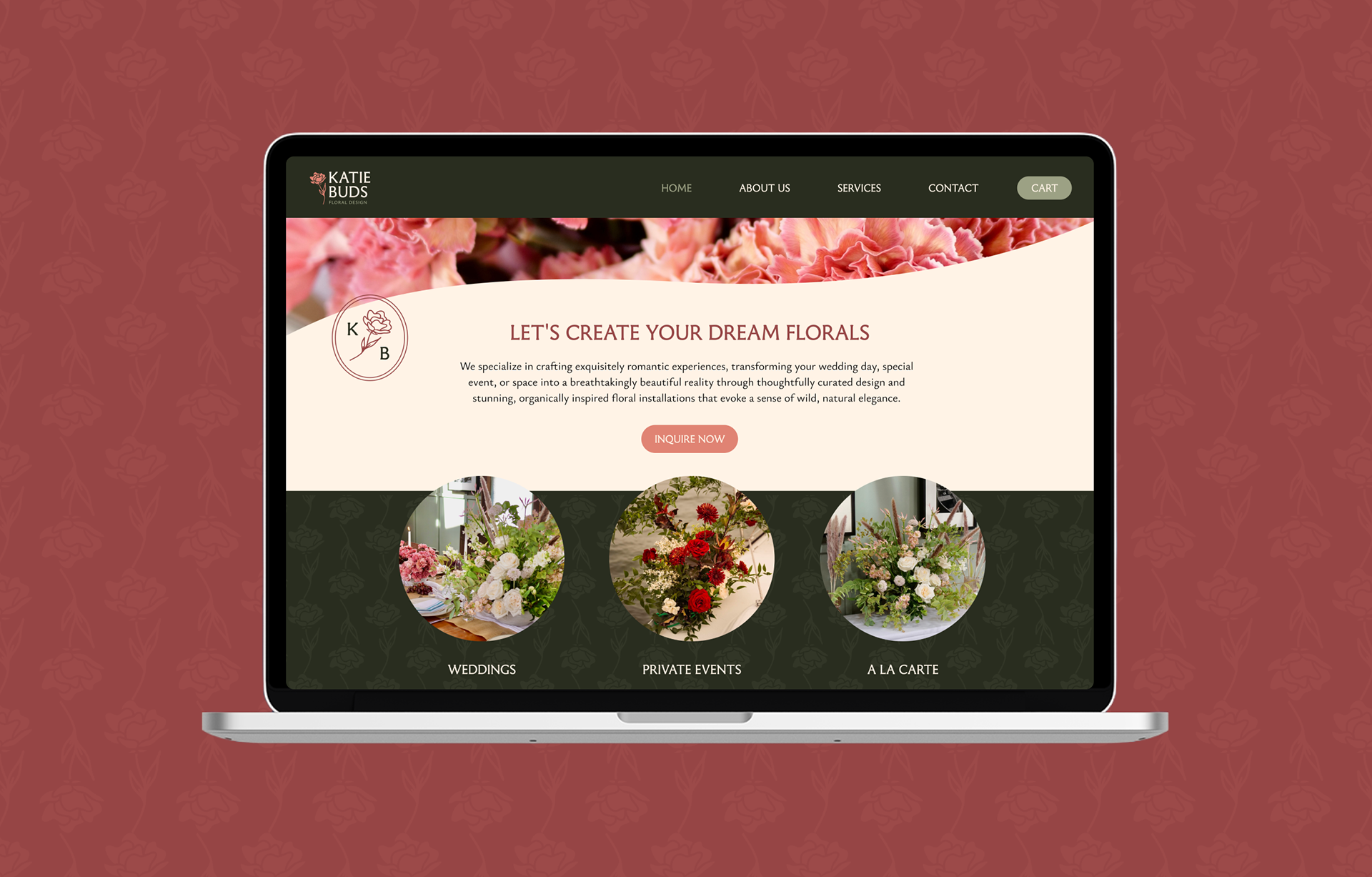
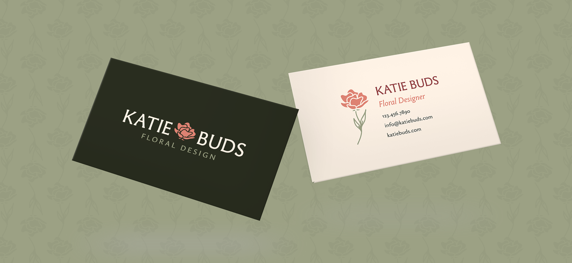
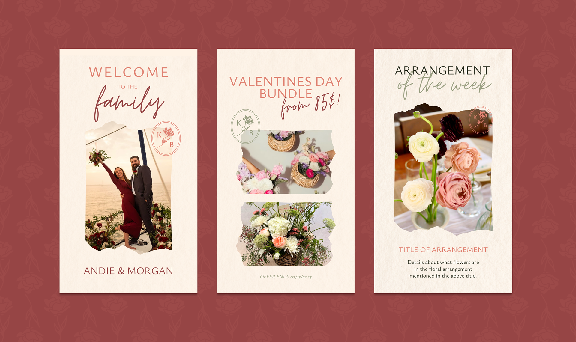
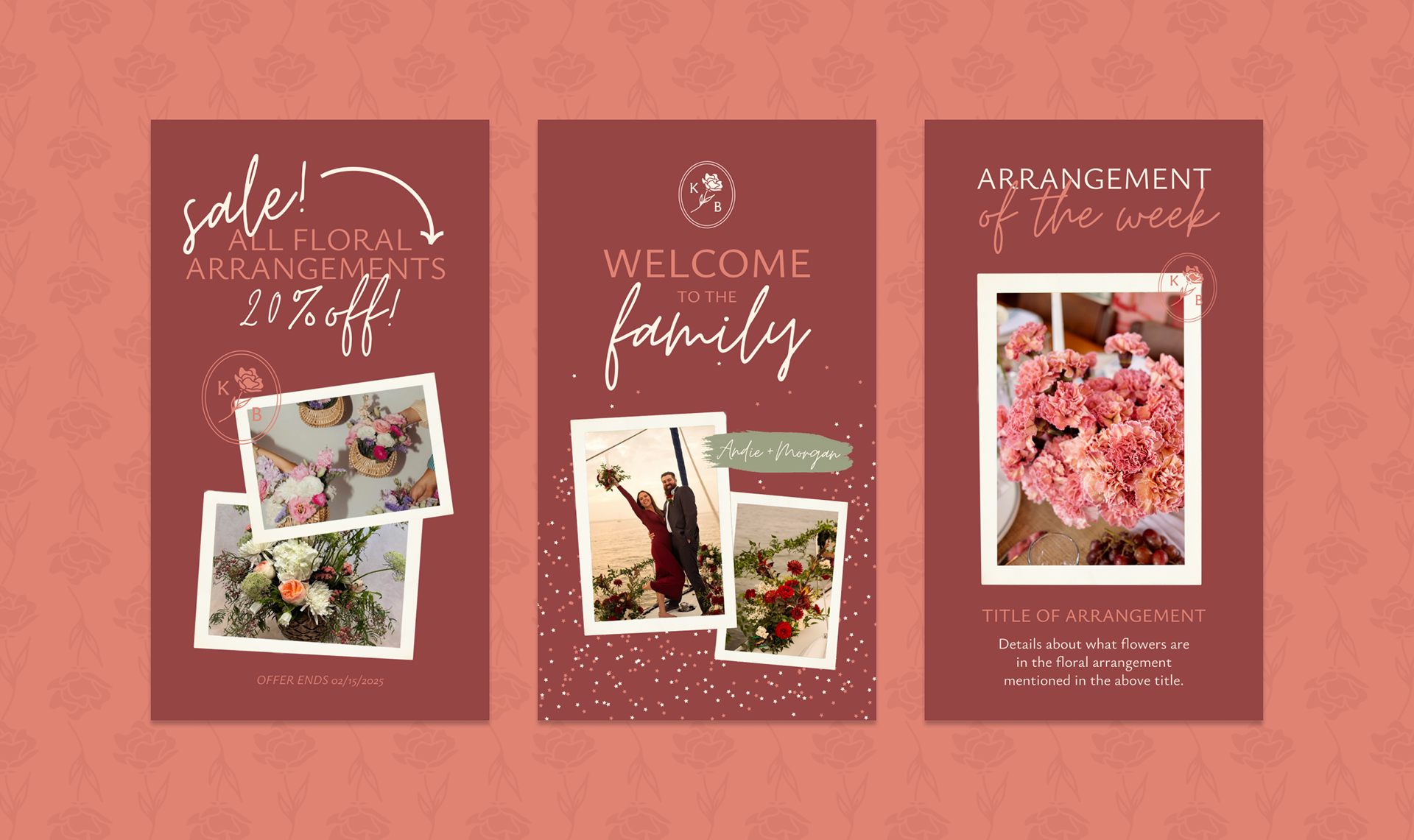
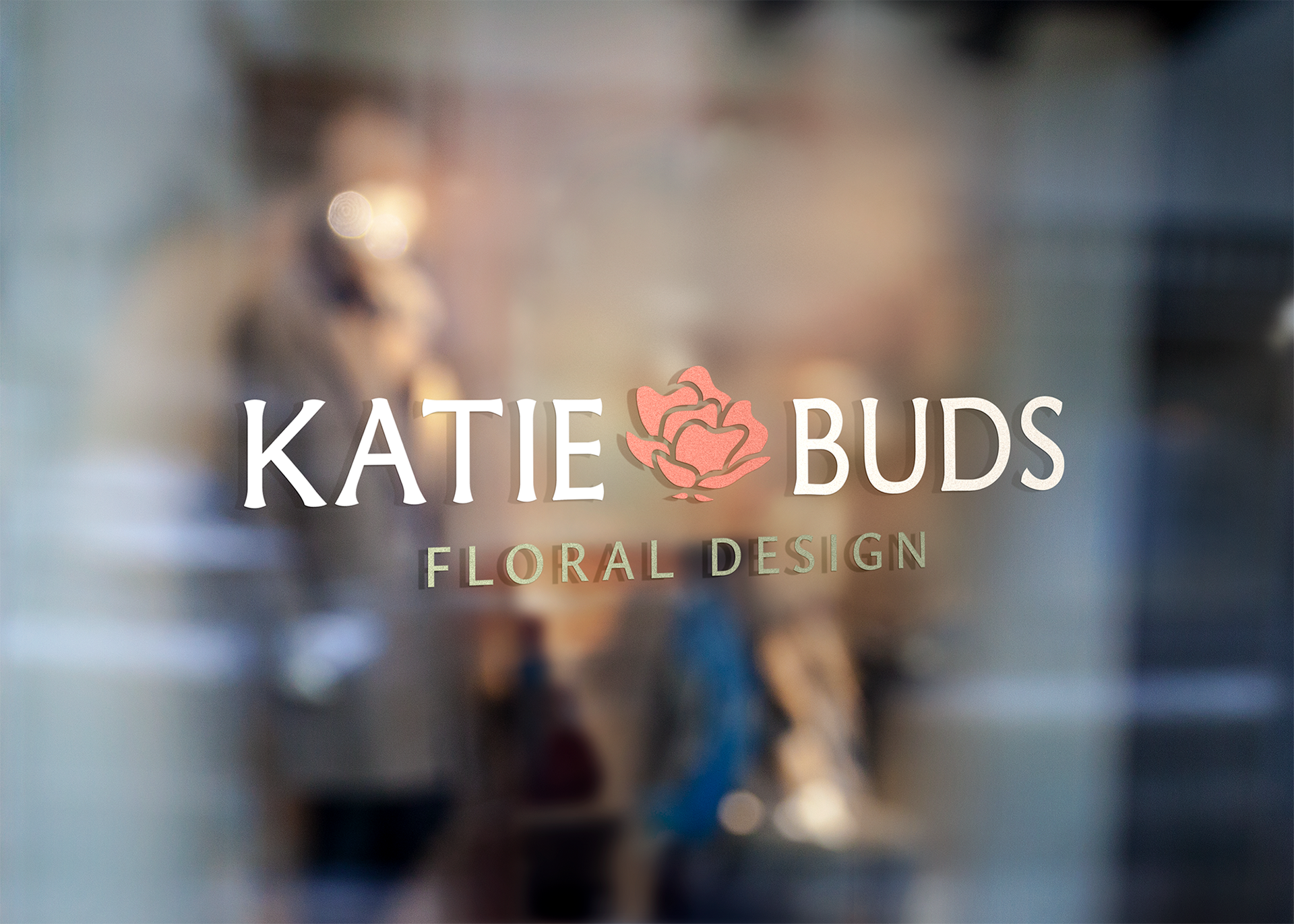

From our first call, Katie’s energy was infectious. She’s a total ray of sunshine with a deep passion for her craft. My goal was to build a brand that matched that warmth without losing her natural sophistication. We anchored the identity with a custom, hand-drawn rose bud to capture that moment of potential right before it blooms. The result is a brand that feels effortless and elegant, giving her stunning floral arrangements the perfect space to breathe and shine! To support this new identity, I developed a cohesive visual system that includes a soft, organic color palette and a thoughtful typography suite. I also created social media templates, business cards, and a landing page to ensure Katie Buds maintains a consistent presence as her business grows. Every detail was designed to be as intentional as her floral work, creating a polished brand that feels easy to connect with for her customers.